Code
library(knitr)
library(dplyr)
library(redav)We found multiple datasets on the California Health and Human Services Agency’s (CalHHS) Open Data Portal. In particular, to explore cardiovascular health of different demographics, we found a dataset called “Readmissions for Isolated Coronary Artery Bypass Graft (CABG) Complications”. 1
The dataset includes the latest publicly available data from the California Coronary Artery Bypass Graft (CABG) Outcomes Reporting Program (CCORP), used for its annual performance reporting requirements. Every six months, hospitals around the state of California submit clinical data through a secure online web application to the Office of Statewide Health Planning and Development (OSHPD). A “Data Contact” person at each hospital acts as a liaison between CCORP and cardiac surgeons. Once the data is finalized and officially submitted to the state, CCORP requires surgeons to review their data and sign a “Surgeon Certification Form.” This certification affirms that surgeons have reviewed their data, ensuring the accuracy and completeness of the cases assigned to them. 2
The initial dataset was created two years ago, but was updated as recently as 2 weeks ago. It is unclear how long it will take for more recent years to get added to the dataset.
The data is published as a CSV file, which makes importing it a simple task. We can just use R’s built-in read.csv function to import the data after downloading the dataset onto our local computer. We can see that there are 1008 observations (rows) and 7 variables (columns) in the data frame after importing the dataset.
library(knitr)
library(dplyr)
library(redav)cab = read.csv("cab.csv") |> rename("Complication" = complication,"Category" = category,"Readmission" = readmission, "Percentage Readmitted"=Yes)
str(cab)'data.frame': 1008 obs. of 7 variables:
$ Year : chr "2018-2019" "2018-2019" "2018-2019" "2018-2019" ...
$ Complication : chr "Deep Sternal Infection" "Deep Sternal Infection" "Deep Sternal Infection" "Deep Sternal Infection" ...
$ Category : chr "Age" "Age" "Age" "All" ...
$ Strata : chr "0 to 40" "41-65" "66 to Max" "All" ...
$ Readmission : chr "N" "N" "N" "N" ...
$ Percentage Readmitted: num 0 0.00109 0.00081 0.00093 0.00169 0.00082 0.00075 0.00122 0.00085 0.00162 ...
$ Count : int 0 11 11 22 5 16 1 6 16 1 ...Each row contains the count of a complication, given a certain category and strata within that category, with subsequent readmission counts. This can be seen clearly by printing out the first couple of rows:
kable(cab[1:6, ], caption = "Head of our data")| Year | Complication | Category | Strata | Readmission | Percentage Readmitted | Count |
|---|---|---|---|---|---|---|
| 2018-2019 | Deep Sternal Infection | Age | 0 to 40 | N | 0.00000 | 0 |
| 2018-2019 | Deep Sternal Infection | Age | 41-65 | N | 0.00109 | 11 |
| 2018-2019 | Deep Sternal Infection | Age | 66 to Max | N | 0.00081 | 11 |
| 2018-2019 | Deep Sternal Infection | All | All | N | 0.00093 | 22 |
| 2018-2019 | Deep Sternal Infection | CABG type | CABG+Valve | N | 0.00169 | 5 |
| 2018-2019 | Deep Sternal Infection | CABG type | Isolated CABG | N | 0.00082 | 16 |
One issue we can see right away is that some strata do not have any counts for complications.
library(dplyr)
filtered = cab |> filter(Count == 0)
kable(filtered[1:6, ], caption = "Head of our filtered data with 0 counts")| Year | Complication | Category | Strata | Readmission | Percentage Readmitted | Count |
|---|---|---|---|---|---|---|
| 2018-2019 | Deep Sternal Infection | Age | 0 to 40 | N | 0 | 0 |
| 2018-2019 | Deep Sternal Infection | PayorType | Uninsured | N | 0 | 0 |
| 2018-2019 | Deep Sternal Infection | Race | Native | N | 0 | 0 |
| 2018-2019 | Post-Operative Dialysis | PayorType | Uninsured | N | 0 | 0 |
| 2018-2019 | Post-Operative Dialysis | Race | Native | N | 0 | 0 |
| 2018-2019 | Post-Operative Renal Failure | PayorType | Uninsured | N | 0 | 0 |
From this selection, we can see that there are certain groups that are either underrepresented or are generally less at risk for heart disease and therefore less in need of the CABG surgical procedure. It makes sense that the youngest age group - “0 to 40” - is less at risk than older age groups but we would still expect perhaps a few rare cases of heart disease. Similarly, we would also expect there to be some cases of heart disease for the Native American group, but it is likely an underrepresented population in this data. 3 Additionally, we can see that patients that are uninsured seem to have fewer instances of heart disease. This seems paradoxical, as uninsured patients are generally more at risk for health issues and worse health outcomes than insured patients. 4 However, it is also known that “uninsured individuals are less likely than those with insurance to receive preventive care and services for major health conditions and chronic diseases”. 5
We have mostly nominal categorical data with discrete counts.
Our first goal is to examine how complications, readmissions, and demographics change over the course of the three years that we have data for. In order to analyze this, we will compare the counts for each categorical variable over each year. Given that we only have three years of data, we expect to see relatively little change over time.
To determine the most common complications associated with CABG, we can use the data to identify and visualize the most frequent complications by focusing on the Complication variable. This visualization can be done with a simple bar chart.
To address which complications most often lead to readmission to the hospital, we will examine the relationship between complications and readmission. We can create a visual such as a bar chart or an alluvial plot to display this.
In order to understand how demographic data impacts the likelihood to face a complication from a CABG procedure, we will use the \(\chi^2\) test. We can also visualize this with a mosaic plot.
Finally, to investigate how demographic data impacts the likelihood of readmission given any particular complication, we can similarly use a \(\chi^2\) test and mosaic plot.
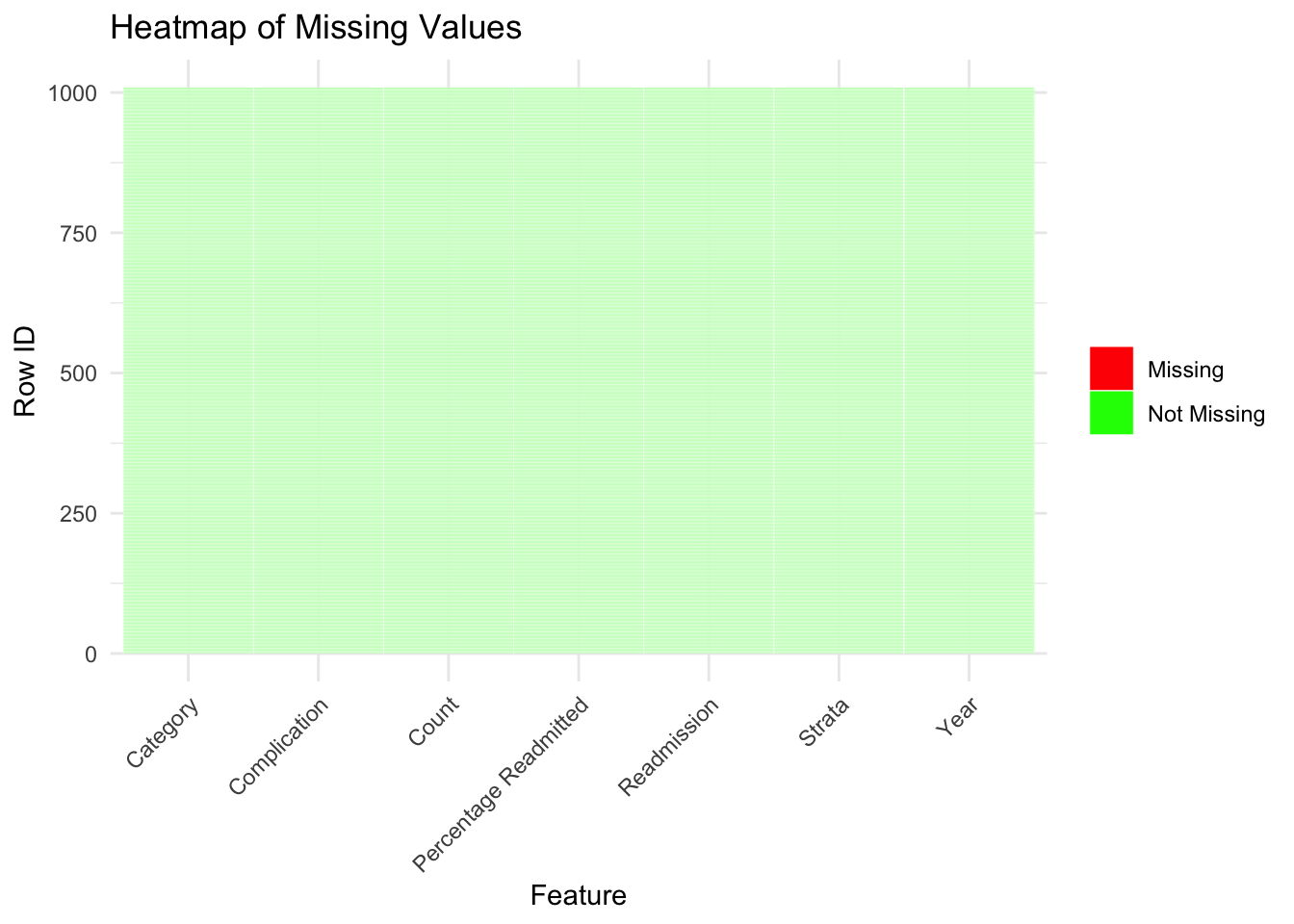
Initially, we can see that there are no missing values in our dataset.
library(dplyr)
library(tidyr)
library(ggplot2)

missing_data <- cab %>%
  mutate_all(~is.na(.)) |>
  mutate(row_id=row_number()) %>%
  pivot_longer(-row_id, names_to="feature", values_to="values")


ggplot(missing_data, aes(x = feature, y = row_id, fill = values)) +
  geom_tile(color = "white") +
  scale_fill_manual(values = c("TRUE" = "red", "FALSE" = "green"),labels = c("Missing", "Not Missing"),limits = c("TRUE", "FALSE"), guide_legend(title = ""))+
  labs(title = "Heatmap of Missing Values", x = "Feature", y = "Row ID") +
  theme_minimal()+
  theme(axis.text.x = element_text(angle = 45,hjust=1))
is_null <- function(x) {
  ifelse(is.na(x), TRUE, FALSE)
}

new_wide = cab |> mutate(row_id=row_number()) |> pivot_wider(names_from = Category, values_from = Strata)

missing_wide_data = new_wide |>
  mutate_all(~is_null(.)) |> mutate(row_id=row_number()) %>%
  pivot_longer(-row_id, names_to="feature", values_to="values") |> subset(feature !="All") |> mutate(feature = factor(feature, levels=c("Age", "CABG type","Gender","PayorType" , "Race", "Complication","Count","Percentage Readmitted","Readmission","Year")))


ggplot(missing_wide_data, aes(x = feature, y = row_id, fill = values)) +
  geom_tile(color = "white") +
  scale_fill_manual(values = c("TRUE" = "red", "FALSE" = "green"),labels = c("Missing", "Not Missing"),limits = c("TRUE", "FALSE"), guide_legend(title = ""))+
  labs(title = "Heatmap of Missing Values after Pivot Wider", x = "Feature", y = "Row ID") +
  theme_minimal() +
  theme(axis.text.x = element_text(angle = 45,hjust=1))
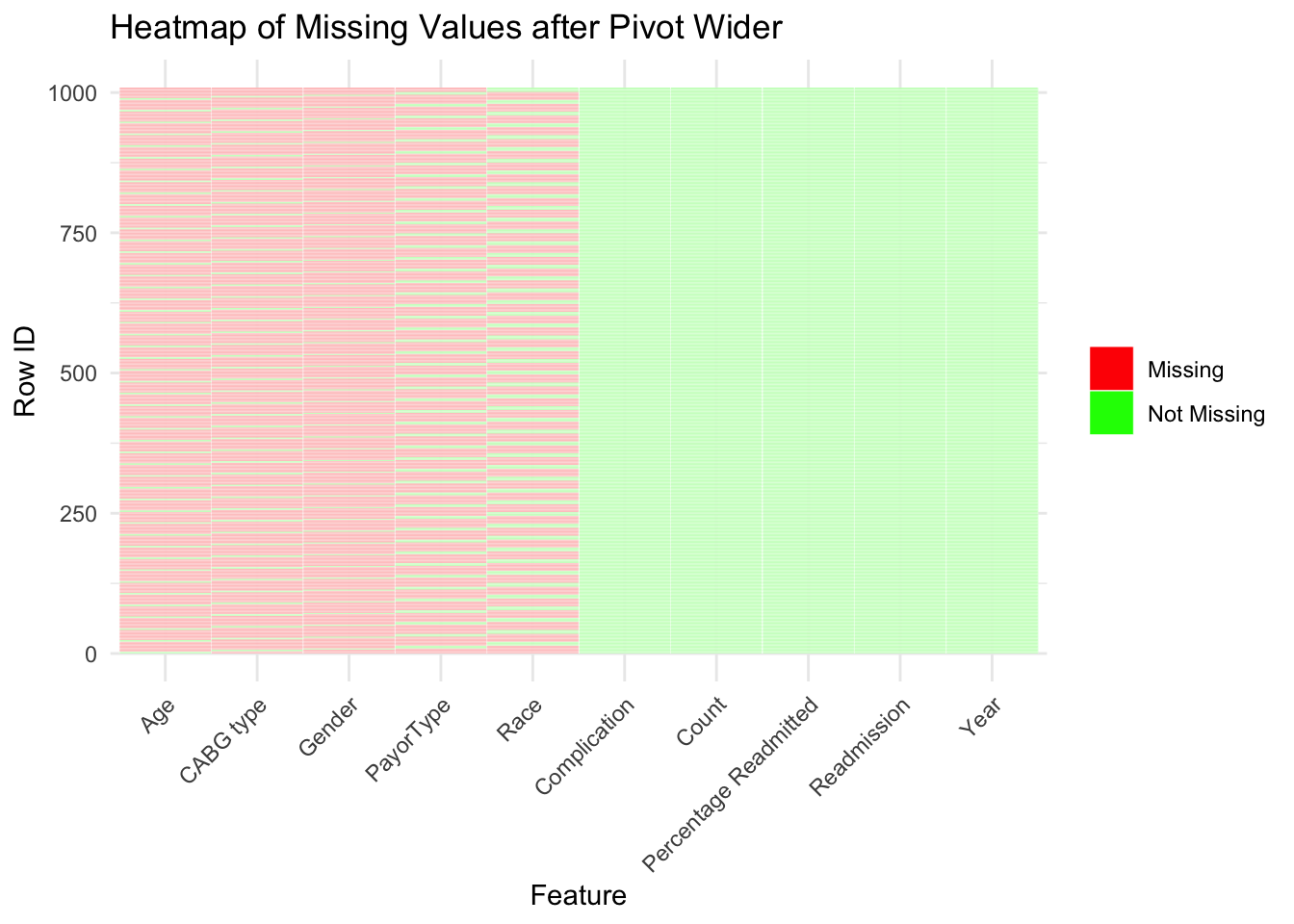
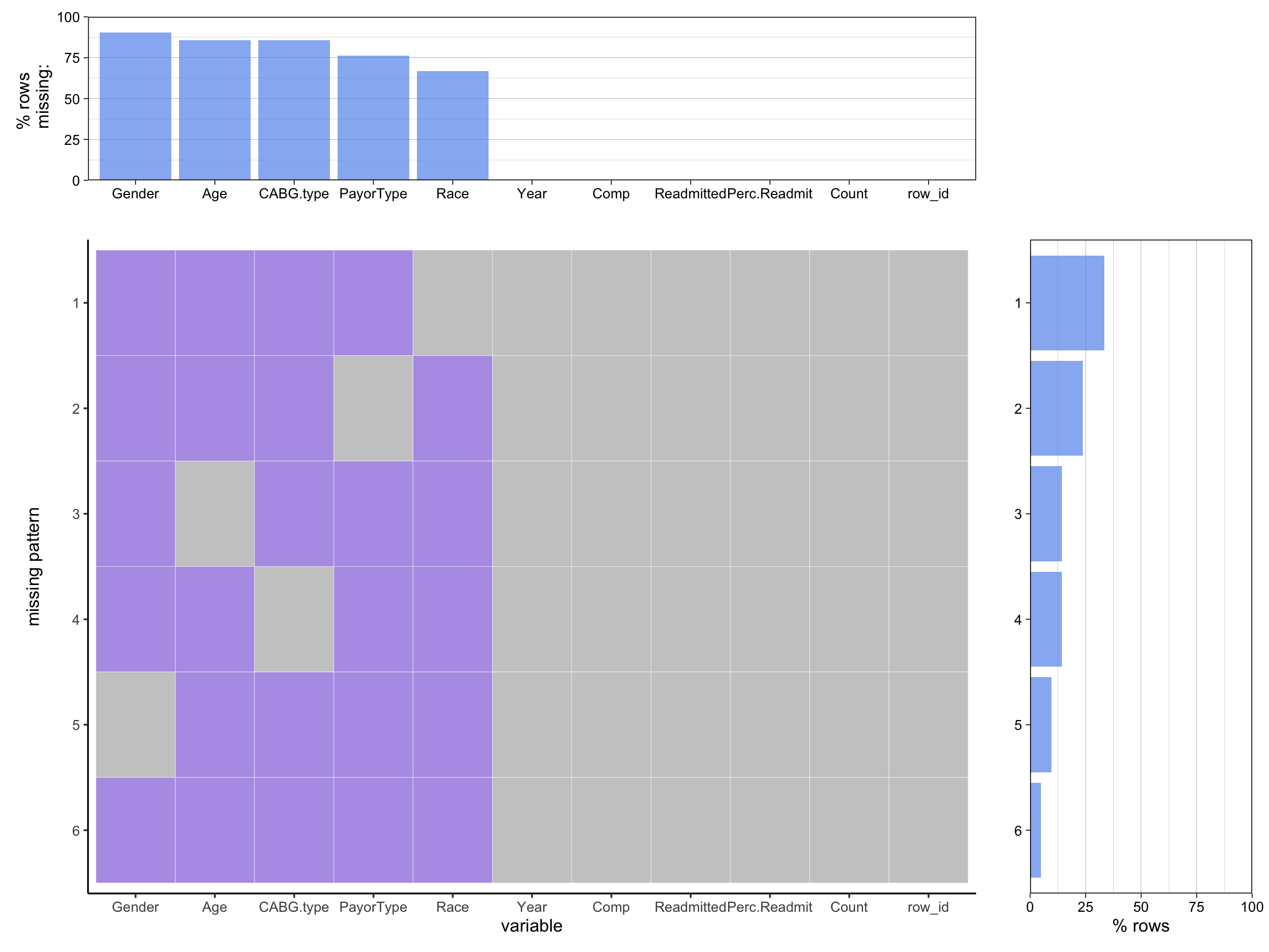
However, we can see that the data is formatted in a way that makes it impossible to see the relationship between different variables. This is likely due to de-identification protocols which is a standard practice for HIPAA compliance. HIPAA compliance is important so that publicly available patient data is not traceable back to a specific person. Our data for instance does not have entries that relate specific complications to both Age and Race at the same time. Instead we only have demographic data for each complication, but no overlap in types of demographics which are called Strata in our data. The plot above shows how each entry in our data lacks those relationships. We can see that each row always has an entry for Complication, Count, Percentage Readmitted, Readmission, and Year.
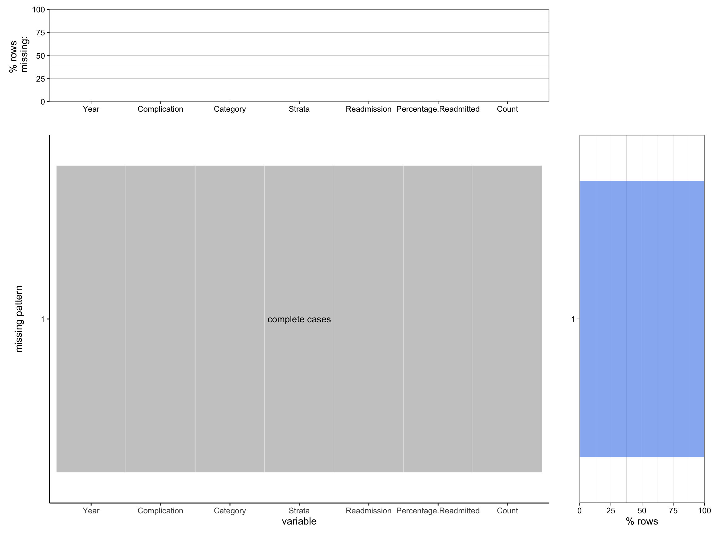
Using the ‘redav’ package, we can see the same patterns that we observed above:
cabg = cab |> subset(Category !="All")
wide_cabg = new_wide |> rename("Comp" = Complication, "Perc.Readmit" = `Percentage Readmitted`, "Readmitted"= Readmission) |> subset(select = -c(All))
plot_missing(cabg, percent = TRUE)
Scale for y is already present.
Adding another scale for y, which will replace the existing scale.
Scale for y is already present.
Adding another scale for y, which will replace the existing scale.
plot_missing(wide_cabg, percent = TRUE)Scale for y is already present.
Adding another scale for y, which will replace the existing scale.
Scale for y is already present.
Adding another scale for y, which will replace the existing scale.